About the project
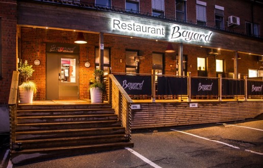
A new vintage restaurant was about to start in Fredrikstad and they needed a distinct logo and a new website. they needed a logo with a very strong ‘B’ for Bayard.
Challenge
The challenge was deciding on the color and how to make timeless logo that will be used for many years.
Response
The customer loved all the samples i forwarded to him and the one he particular chose was my favorite because of instead of the ‘B’ being the iconic letter….i stretched the ‘Y’ and made it the most visible on and with a different color.
Bayard Restaurant Logo
ClientRestaurant BayardMy roleLogo DesignAgencyCall2Action ASLinkhttp://www.restaurantbayard.no
Share
